Uncommon Projects
Class: ART 252 Image
Professor: Kristen Pericleous

The assignment given was to use Adobe Photoshop and the masking tool within the program to compose a design that renders a word of my choosing. This design was to be composed of the black ink marks physically made using random objects onto black sheets of paper at the start of the project. The word I chose to render and the concept that it conveys was to emerge from the style and arrangement of the marks themselves. The final word and concept was to be enhanced by the images that I make and communicate my concept clearly and powerfully. The final piece was to be scanned into the computer and refined, then turned in digitally on a canvas size that is at least 10"x10."
As far as research goes, I had to figure out an uncommon word that conveyed the concept of my marks. I had to be careful about this and spent a lot of time brainstorming and looking up synonyms for initial ideas. In addition, for this project I had to learn how to use the Adobe Capture app as well as the Adobe Scan app to upload my marks digitally. I also learned how to use the Masking tool in Adobe Photoshop to compose my design.
To start off I experimented with typographic mark making using various random found objects, ink and blank paper. Using the objects, I created different marks by dipping in or painting with ink and experimenting with different ways of laying the object on my paper. I tried to use different force, speed, angle, and intention to create marks that exude different attitudes and feelings.


I was then tasked to choose 3 different marks and come up with 4-6 corresponding words for each one. These words were to capture the vibe, attitude, or overall visual for each mark.

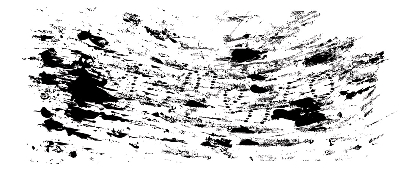
Next, based on the in-class demo and the feedback I received during small group critiques of our marks and word choices, I choose one mark along with one word that I most favored. Then, I completed 4 composition sketches for that mark/word combo. This resulted in 4 compositional options. My word was “Momento”, which represents the passing of time and the fading of memory. So my sketches all have faded letters along with fast dashes that show the speed of time.


Then, I watched an in class demo of Photoshop masking and Adobe Capture/Scan. Once I knew how to do this I used the Adobe Capture app to scan my marks into the computer.
After receiving feedback from my peers and professor, I was able to narrow down my sketches to one design for the project. Using Adobe Photoshop and its masking tool, I began my digital composition. Following this, I received even more feedback from my peers suggesting that I make the letters more legible. Using that commentary, I edited my composition to create my final draft. There was a lot of thought that went into developing my final design concept. My final design rendered the word ”Momento”. I chose this word because I thought that the style and arrangement of the chosen mark resembled the fade of memory through time. Tiny ink streaks stretch out to give the impression that something is passing very quickly. The words are made up of countless small ink smudges, blurred enough to be read in the composition, like a fuzzy memory in the mind, like remembering like forgetting through time.

